case study
$ cat ~/cases/diamant-tattoo.md
diamant-tattoo
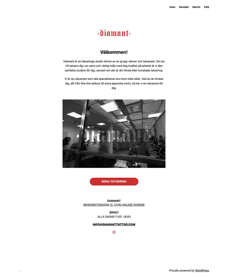
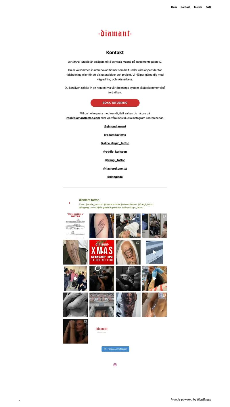
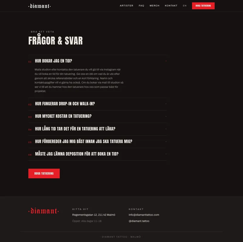
diamant is a real tattoo studio in central malmö — seven artists, strong instagram, a red blackletter wordmark with actual character. their website: a default wordpress theme with system fonts, no headings, and the artists reduced to a list of links.
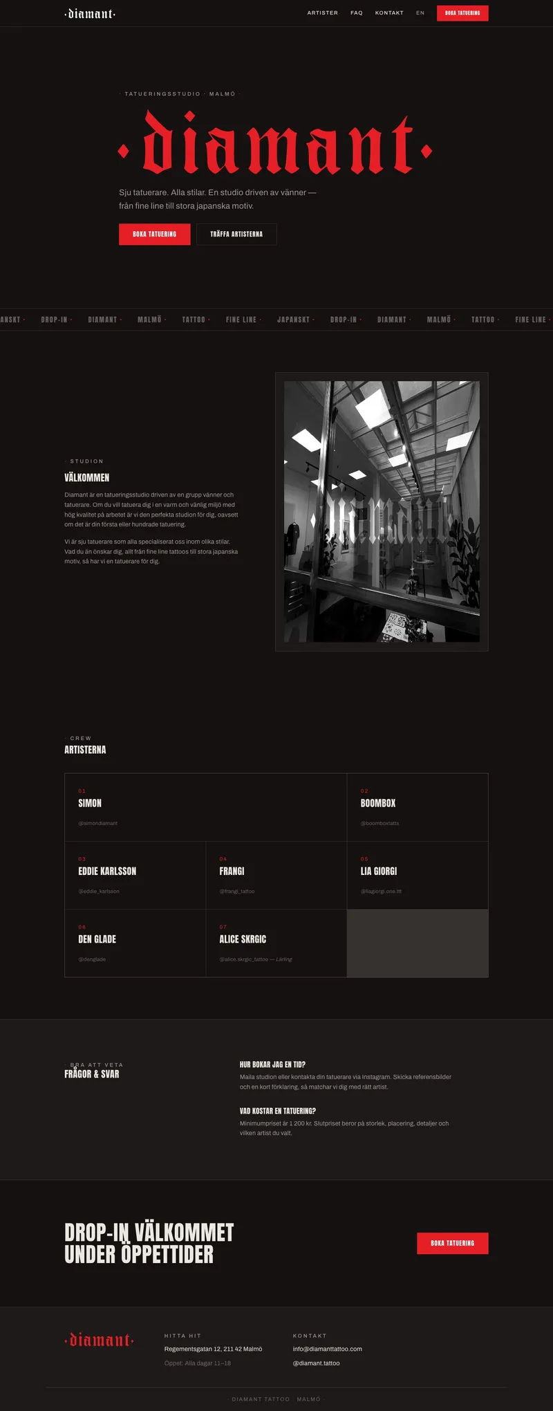
so i redesigned it. unsolicited — audit first, then a full rebuild around the brand they already had. same name, same logo, same content. built as a live pitch.
live → diamant-tattoo.vercel.app
// process
// the audit
first pass: playwright screenshots, dom inspection, asset inventory. the findings wrote the pitch by themselves —
| found | shipped |
|---|---|
| ✗site title was literally "." | ✓real titles + meta on every page |
| ✗no <h1> or <h2> anywhere | ✓semantic hierarchy throughout |
| ✗lang="en-US" on a swedish site | ✓sv-SE default, english at /en/, hreflang wired |
| ✗system fonts next to a blackletter logo | ✓anton + archivo, self-hosted (no google cdn) |
| ✗logo trapped in a 960px png on white | ✓traced to a 4kb svg — red/white/black, scales infinitely |
| ✗7 artists = a list of underlined instagram links | ✓numbered crew grid, one card per artist |
| ✗empty favicon.ico (0 bytes) | ✓on-brand diamond mark |
| ✗fbclid tracking param baked into the booking link | ✓clean per-locale booking urls |
// liberating the wordmark
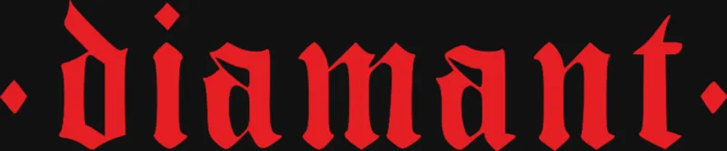
the logo only existed as a raster png on a white background — useless for a dark design. traced with potrace into a 4kb svg, verified faithful to every spike of the letterforms. before / after:

// three decisions
01
keep the brand, change the treatment
same name, same logo, same copy. the red blackletter wordmark and b&w studio photography were always good — they were just sitting in a default wordpress theme. the redesign is an act of respect, not reinvention. the "·" diamond from the logo became the recurring typographic mark: kickers, dividers, marquee, footer.
02
dark ink-editorial, luminance depth
a tattoo studio site should feel like the work. warm near-black (#141110), single accent (their exact red, #e51f25, sampled from the logo), no shadows anywhere — surfaces step up in opacity instead. anton as the display voice, uppercase, one heavy weight.
03
zero-js static, motion in css
astro static output. staggered hero entrance, scroll reveals, seamless blackletter marquee — all css, except a 10-line intersection observer (js-gated, so no-js visitors still see everything). prefers-reduced-motion respected. the faq is a native details accordion.
// before / after
// outcome
- →full site, 4 pages × 2 languages, live on vercel in two days
- →zero client-side js except a 10-line intersection observer
- →local seo rebuilt: real meta, semantic html, tattooparlor json-ld
- →migration = one dns change; no wordpress export drama
$ echo "your craft outgrew your website. let's fix that."